Visualizing Github Projects
Visualizing GitHub Projects with Interactive Graphs
Managing GitHub projects can get messy. Between tracking issues, pull requests, and team performance, it’s easy to lose sight of the bigger picture. I often found myself wondering how to better understand my team’s progress or spot patterns in our workflow without spending hours digging through GitHub data.
To make things easier, I built GitHub Issue Graph, a React app that turns your GitHub project data into interactive charts and graphs. It’s a simple way to track sprint velocity, analyze workload distribution, and even visualize issue dependencies.
Let me walk you through how it works and what it can do.
The Problem
GitHub is great for managing projects, but it doesn’t always give you the insights you need. For example:
- How do you track your team’s sprint velocity over time?
- Are there bottlenecks in your pull request reviews?
- Which issues are blocking progress, and how are they connected?
Answering these questions usually means manually analyzing data, which is tedious and time-consuming. I wanted a tool that could automate this and present the data in a way that’s easy to understand.
How GitHub Issue Graph Works
The app connects to your GitHub repository and fetches data about issues, pull requests, and more. Here’s a quick overview of how it works:
- User Input: You provide details like the repository owner, name, and an optional project ID. A GitHub token is required for API access.
- Data Fetching:
- If you enter a project ID, the app uses GraphQL to fetch data from GitHub’s API.
- If you only enter a repository, it uses REST API calls instead.
- Data Processing: The fetched data is normalized into a flat array and stored in your browser’s localStorage.
- Visualization: The app parses this data and generates interactive graphs to help you analyze your project.
Here’s a flowchart to make it clearer:
Features
1. Interactive Visualizations
The app provides a variety of charts to help you understand your project at a glance:
- Sprint Velocity Chart: Tracks your team’s velocity across sprints.
- Status Chart: Shows the distribution of issue statuses.
- Issue Dependency Graph: Visualizes relationships between issues in a network graph.
2. Team Analysis
You can monitor team performance with charts that show:
- Task distribution by assignee.
- Reviewer workload and performance trends.
- PR creation trends by author.
3. Pull Request Insights
Analyze pull request patterns with charts like:
- PR Review Chart: Review patterns and statistics.
- PR Lifecycle Chart: Time taken for PR reviews and merges.
- Code Churn Chart: Tracks code changes and modifications.
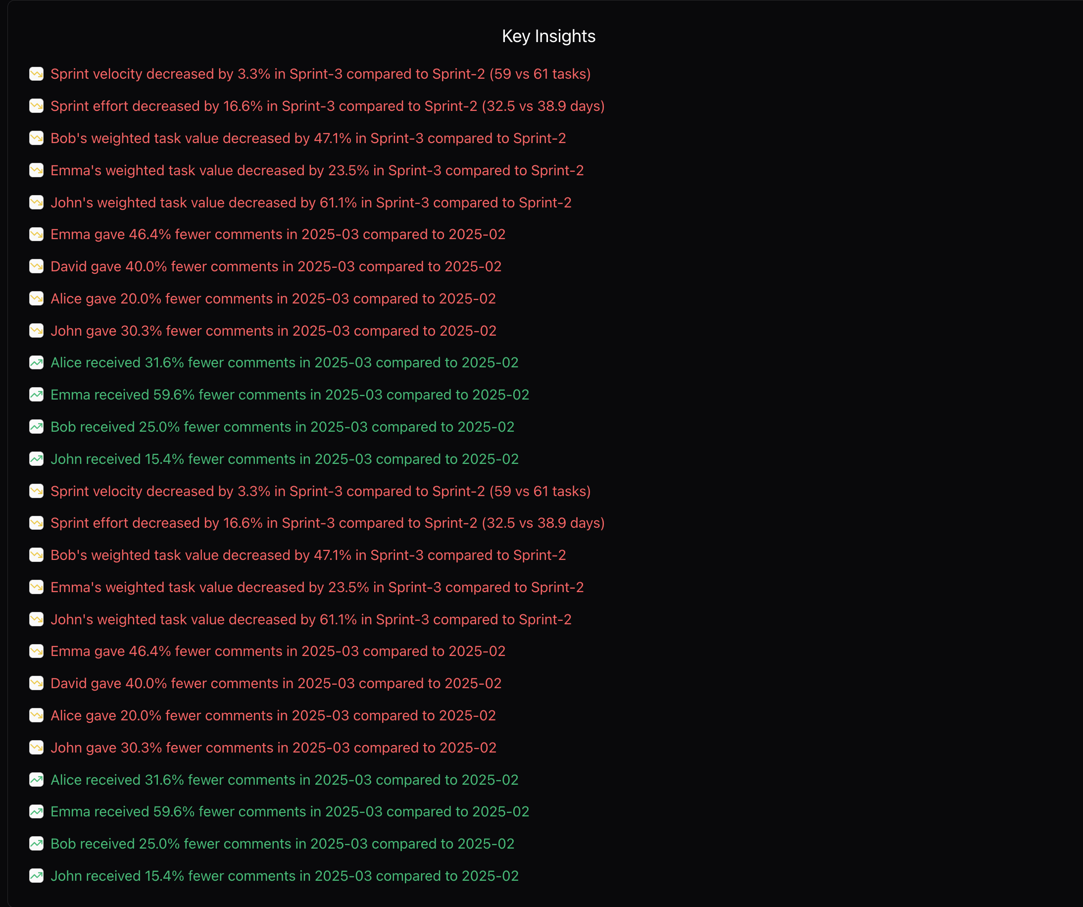
4. Automated Insights
The app generates automated insights based on your data. These insights are color-coded for easy interpretation:
- Green for positive trends.
- Red for areas that need improvement.
How to Use
Getting started is simple:
- Enter your GitHub repository details in the configuration section:
- Repository Owner
- Repository Name
- Project ID (optional)
- GitHub Token (required for API access)
- Click the “Render” button to fetch and display your repository data.
Limitations
While the app is quite handy, it does have some limitations:
- It assumes certain custom fields are configured in your GitHub repository, such as Sprint, Size, Estimate (days), and Actual (days). If these fields are missing, some charts may not work as expected.
- Much of the code for the charts was generated using Cursor, so there’s room for better design and refactoring.
Getting Started
If you’d like to try GitHub Issue Graph, follow these steps:
- Clone the repository:
1
git clone https://github.com/vivekkodira/github-issue-graph.git
- Install dependencies:
1
npm install - Run the app:
1
npm run dev
References
Feel free to explore the app and let me know what you think!