Improvements to the Github Project visualiser
Over the last couple of months, a few new features have been added for my specific needs to the github project visualiser I blogged about here
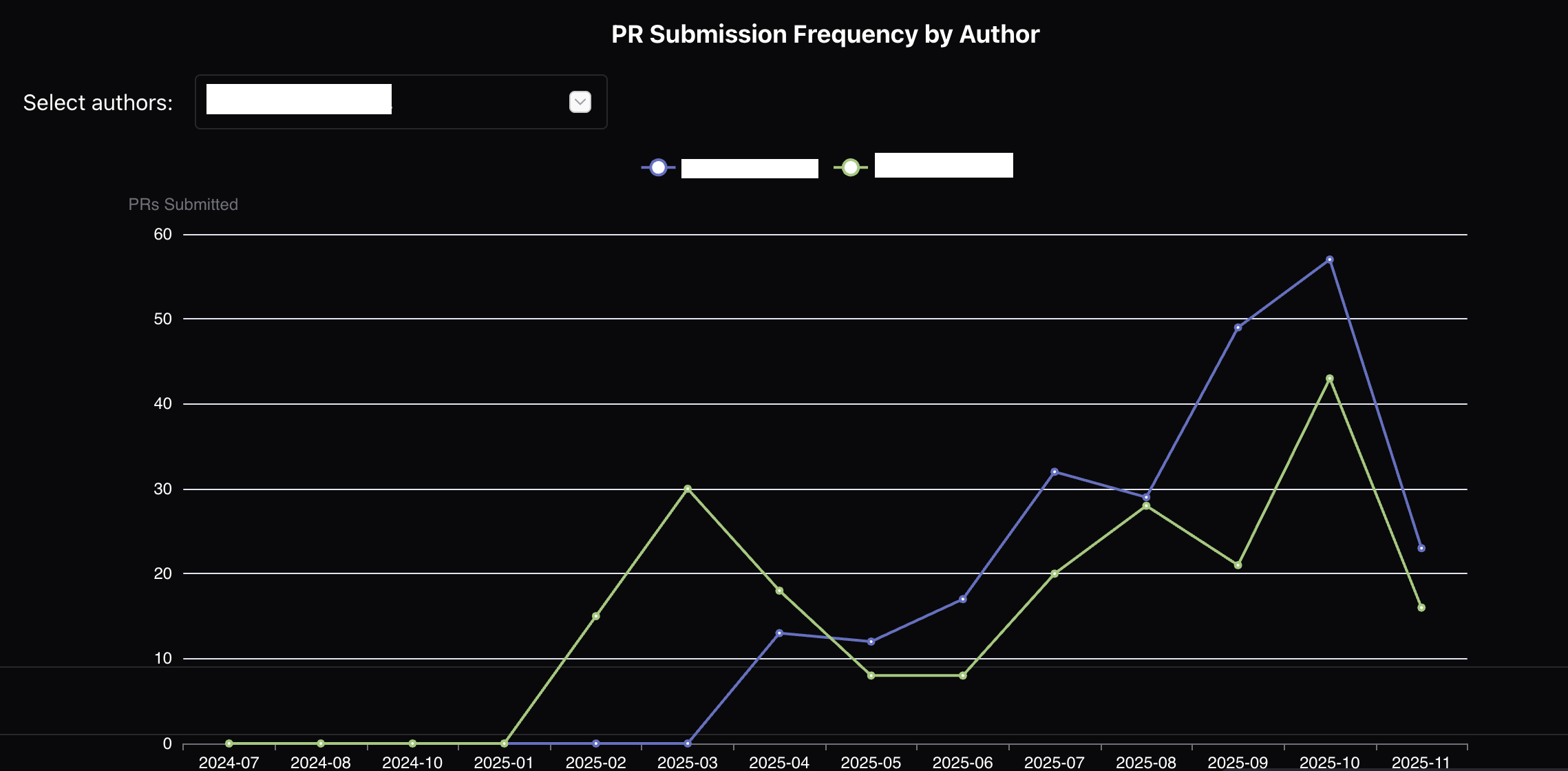
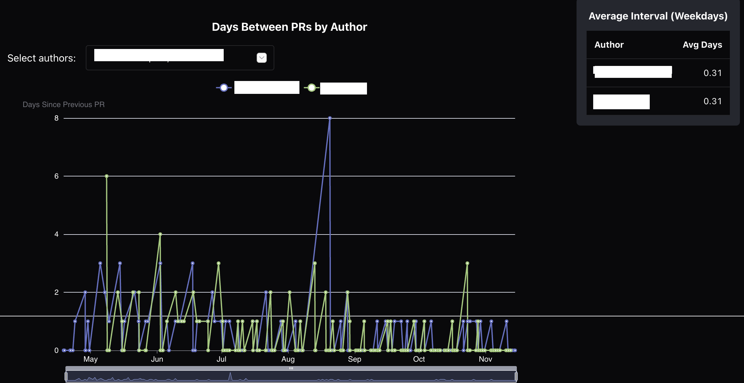
Pull Request Submission Frequency
Sometimes a developer in the team would begin to slack off. I didn’t want to have a discussion without data to back me up. These graphs show the frequency of PRs. The guideline given to the team is to keep the PRs small & frequent - even for large deliverables. I also used the graphs below to showcase to developers how they were doing compared to their peers.
Issues Analysis
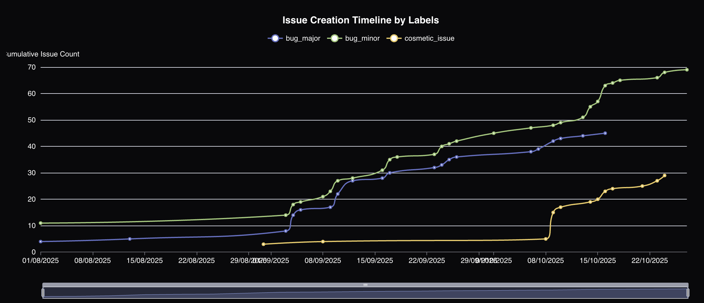
Github’s default issues supports issue categorization using labels. Github projects support issue categorization using custom fields. Different stakeholders in the team ended up using different approaches. And towards the end of the project, I realised some gaps that made it difficult to showcase our efforts. For instance, you cannot search by custom fields in the issues view. And the project views don’t support searching by creation date.
The visualiser now supports an RxDB which is populated by both REST & GraphQL queries. A search interface (still a little WIP) allows me to slice & dice the data & showcase it using graphs.
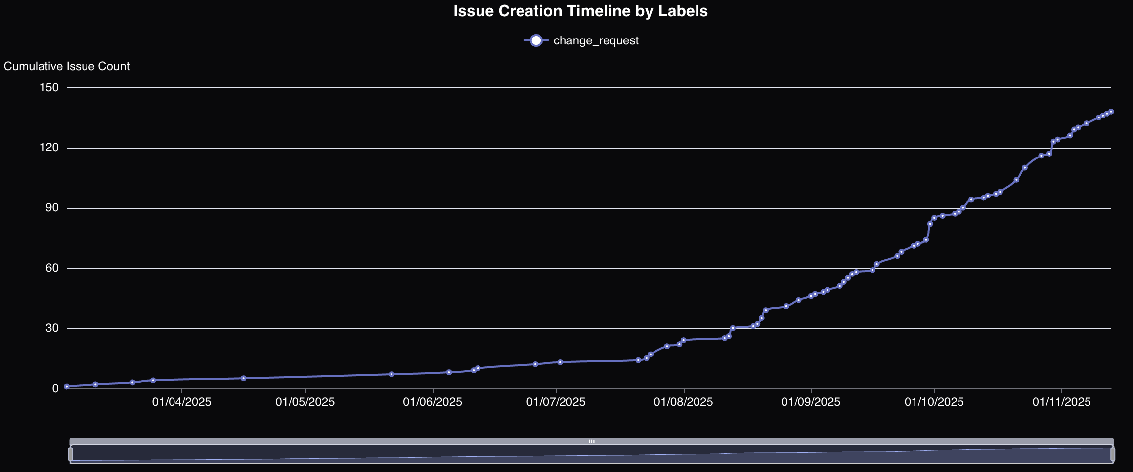
This graph for instance is something that is easy to create in Github
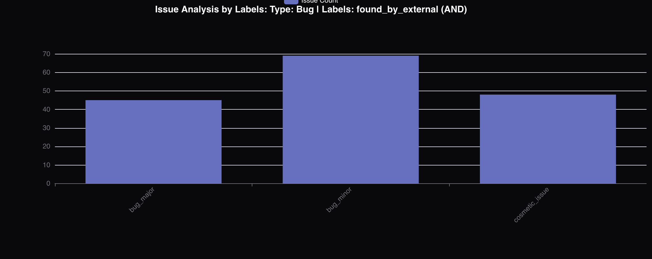
But these two below are not. I was able to show that defect identification & change requests had piled up late in the project.
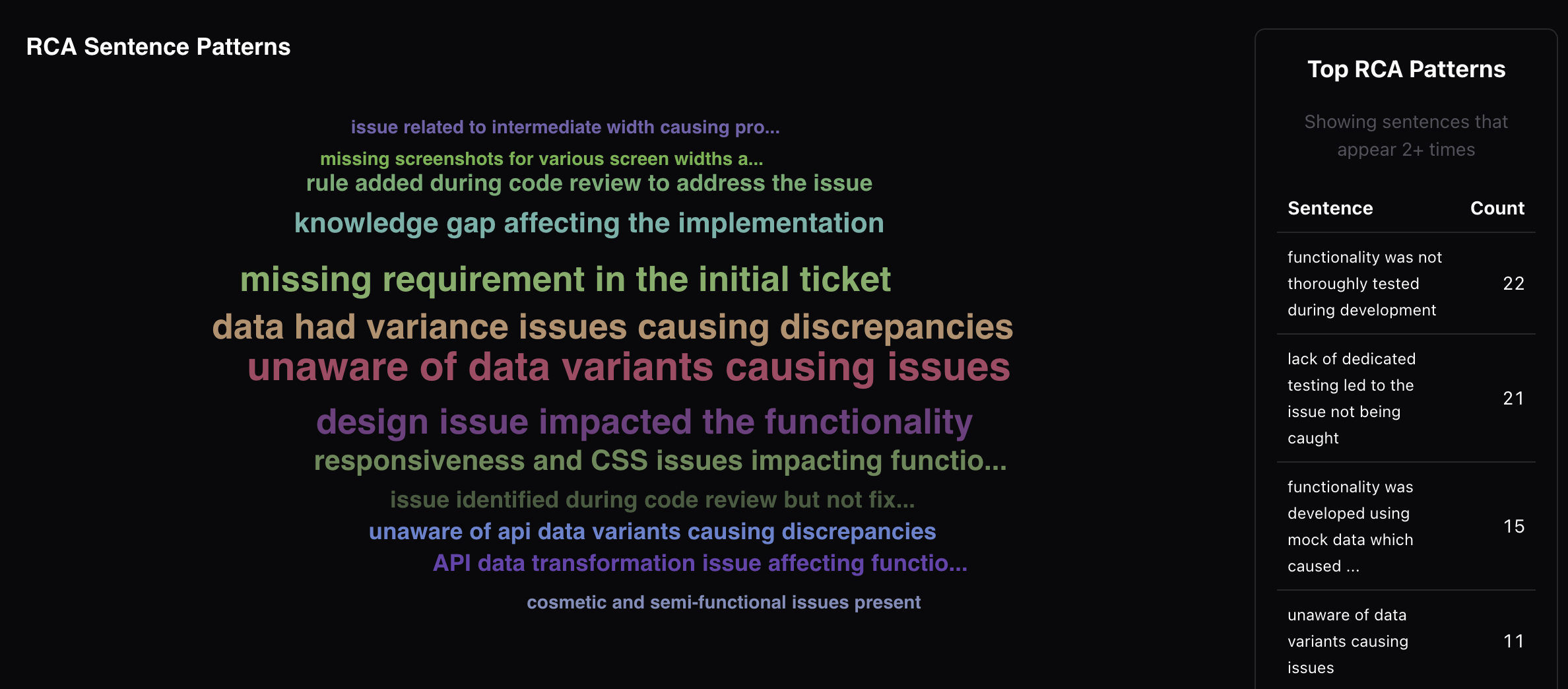
RCA sentence cloud
Another feature I built recently is an RCA sentence cloud. The issues are parsed for an ## RCA section. Because the RCAs were created & curated carefully, this allowd me to create a cloud of RCAs & identify areas which needed the most remediation.
References